Blue is one of those colors that earns its place in almost any room without trying too hard. Not because it matches everything, but because it somehow settles everything. A well made blue vase does something a print or a cushion cannot. It holds its ground from across the room. It reads as an object, not a detail.
What we kept coming back to when putting this together was shape and depth of color. A flat cobalt sitting next to a smoky navy sitting next to something closer to storm grey. These are not decorating afterthoughts. They are pieces you build a shelf or a sill or a side table around.
We looked specifically for vases where the blue itself was doing real work, where the glaze or the finish had actual character rather than just a coat of color. The kind of piece you move from room to room because you cannot quite decide where it looks best, and that is the point.
-
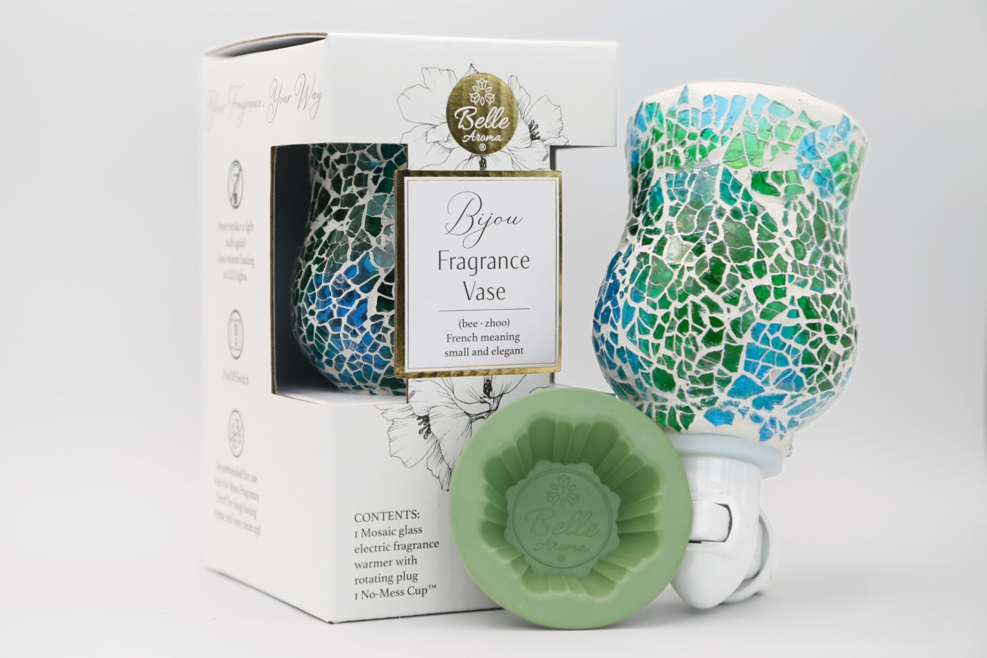
Belle Aroma – Bijou Fragrance Vase Wax Warmer Night Light – BlueGreen
$23.00 -
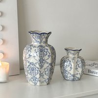
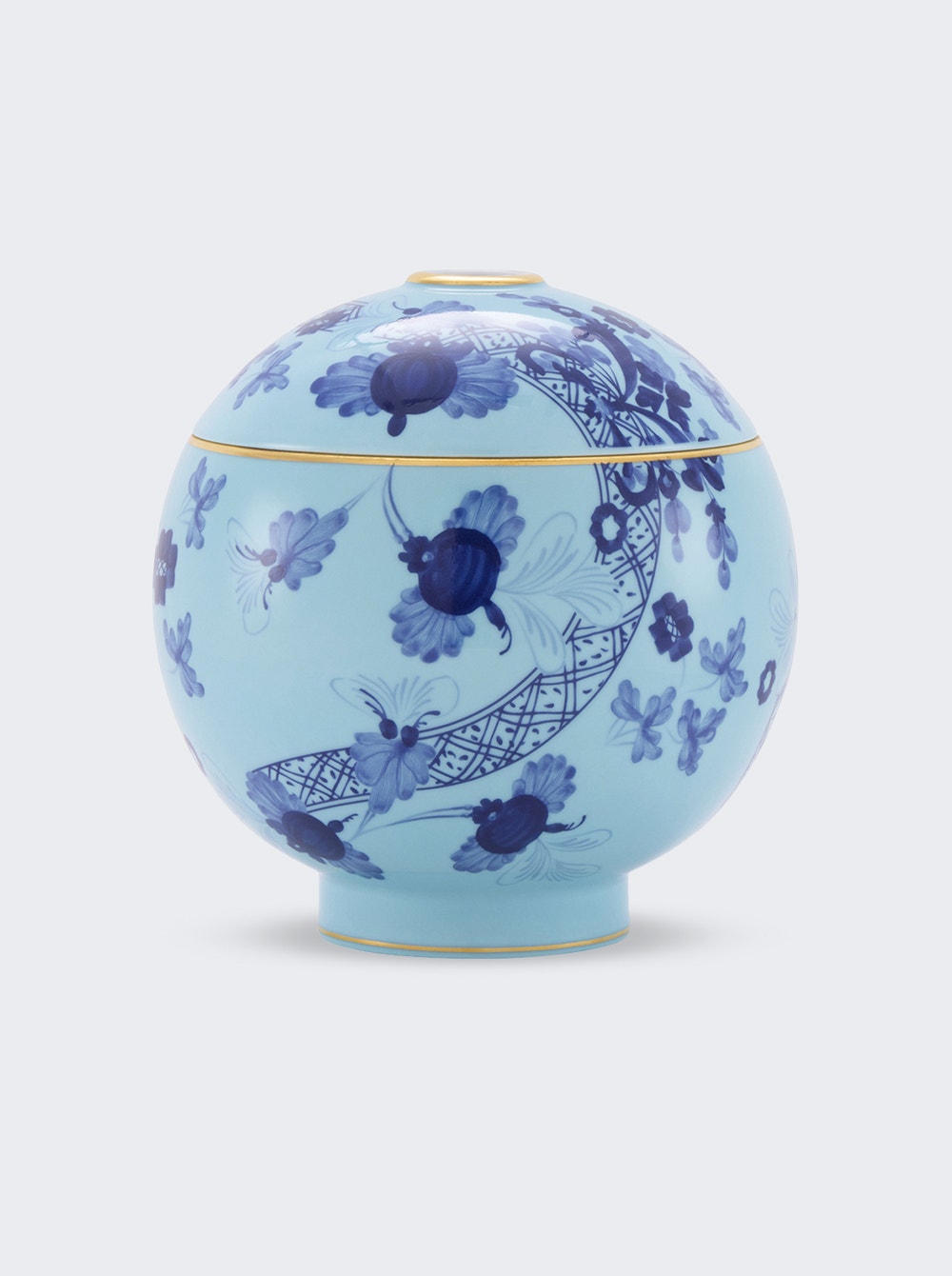
Blue And White Porcelain Ceramic Vase New Chinese Ornament Living Room Flower Arrangement Entrance Decoration Ancient
$41.53 -
Blue Blossoms in Vase – x Natural Oak
$166.90 -

Blue Blossoms in Vase – x Silver Metal
$166.90 -

Blue Blossoms in Vase – x White Metal
$166.90 -
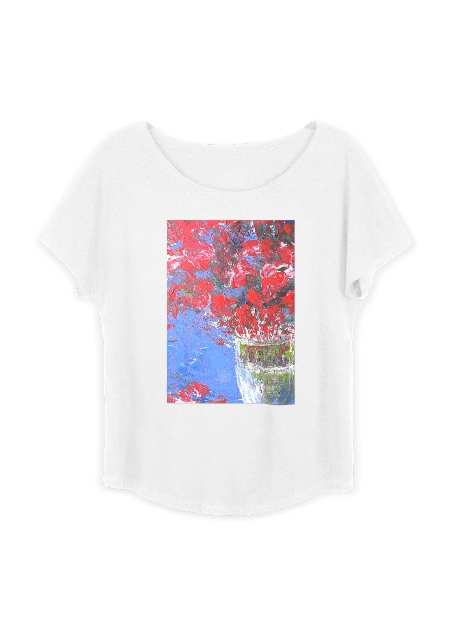
Boatneck Boyfriend Tee – Red Flowers Vase
$35.00 -

Boatneck Boyfriend Tee – Vase With Three Sunflower
$35.00 -
Diffuser Holder Vase Iris Blue
$329.00 -
Elegant White Ceramic Flower Vase With Water Reservoir – Modern Minimalist Design For Home & Florist Wholesale White, Blue, Gray, Pink
$11.59 -

Handmade Vase Pattern Mens Casual Shorts Blue Relaxed S W
$9.56 -
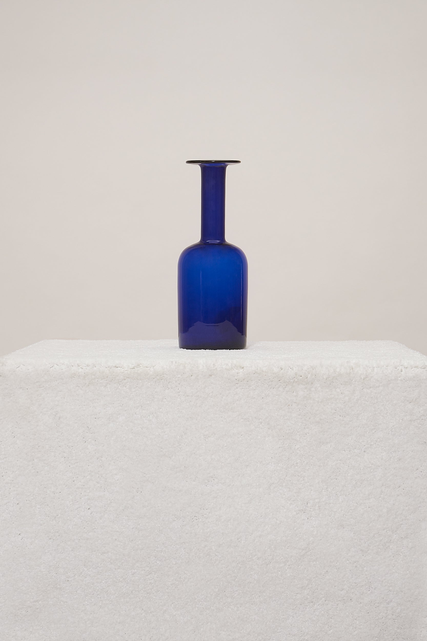
HOLMEGAARD DENMARK VASE
$375.00 -
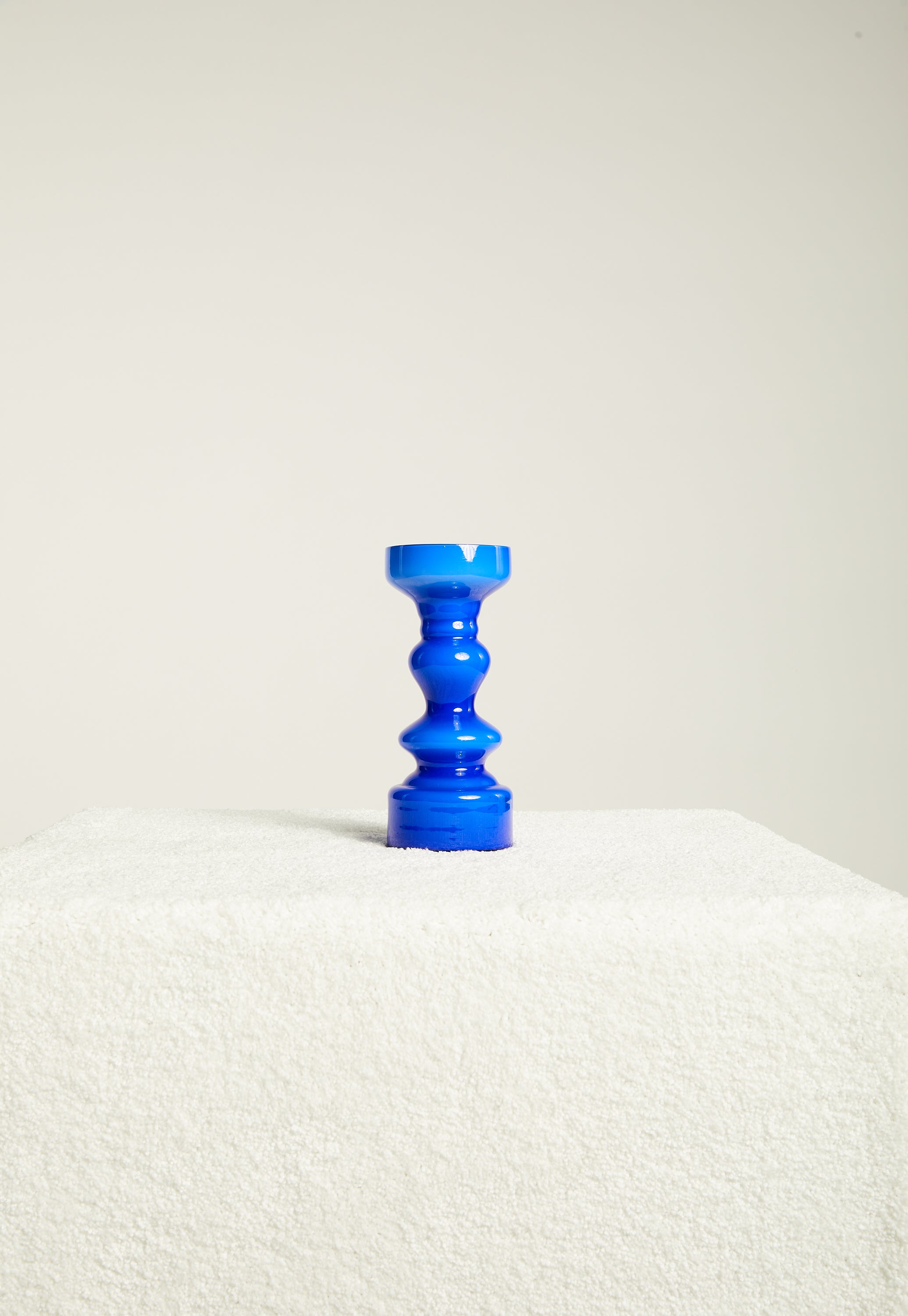
JAPANESE BLUE HOOP VASE
$120.00