You remember walking into a space and immediately wanting to leave? That happened to me the very first time I stood in the bathroom of my Chorlton flat. As soon as I walked in, the smell hit me – that sort-of-musty, sort-of-antiseptic smell that screams “rental property circa however long ago beige was the pinnacle of sophistication”.
I’m staring at these tiles which clearly have seen better decades, and this mirror with a frame which is nothing short of aggressively bronze plastic. Whoever decided that was a good choice was committed to telling everyone this was not real metal.
But here’s the strange thing – the window faces east. And that morning, sunlight was pouring in, bashing off those tragic tiles, casting gorgeous, shimmering reflections across the ceiling. Looked like sunlight reflecting off of water. And that’s when things clicked inside my head. I didn’t have to live directly adjacent to the ocean to feel as if I am.
And now look, I understand. Anything coastal-themed can be misinterpreted quickly. We’ve all been in bathrooms that resemble a nautical gift shop from whence someone ripped every item off the shelf and then sneezed everywhere else. Anchors galore – anchors on literally everything. Shells glued to mirrors using a hot glue gun that appears to have been purchased in 1997. Rope trim collecting dust and causing you to ponder whether actual pirates had functioning plumbing systems. There exists a massive distinction between coastal-style inspiration and maritime chaos.
It is not difficult to avoid coastal-themed items entirely. It is choosing said items as if you’re aware of what you’re doing.
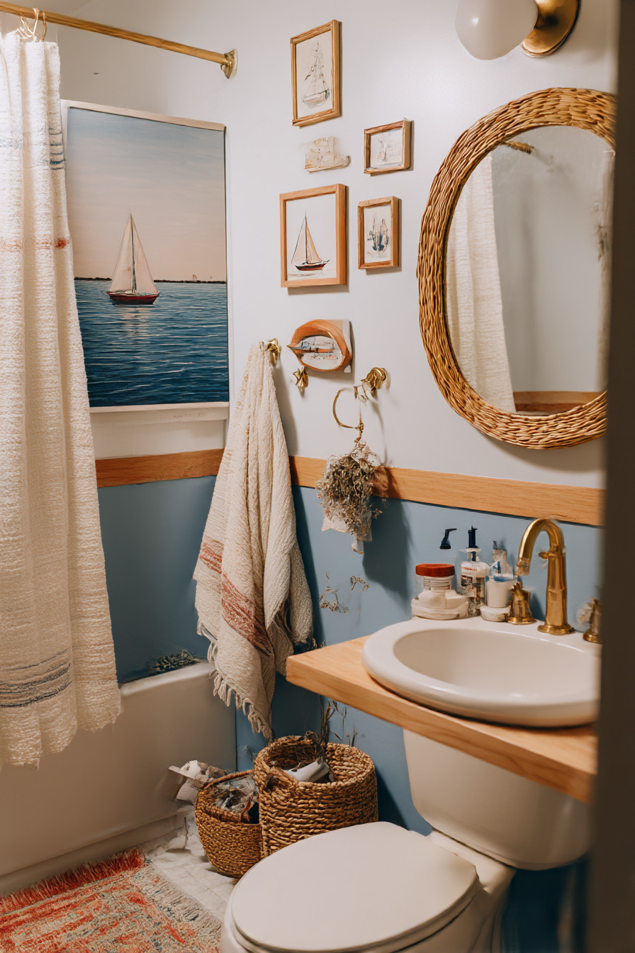
Colour has always been my go-to when a space seems to fundamentally wrong. In lieu of the expected use of navy & white (don’t get me wrong, it is possible for this combination to work effectively when done correctly), I opted for a weathered sage green. Think driftwood that’s been tossed about in saltwater for months. This is a soft gray-green colour that will appear differently based upon the lighting.
Found the precise match for this colour at the local paint shop after bringing approximately 15 different samples back to show them against that east-facing window at varying points throughout the day. Cost £32 for enough paint to provide two solid coats; completely changed the ambiance of the entire space. The beige tiles no longer appeared as if they were an error from the ’80s — they looked as if they were deliberate, such as warm sand beside sea-glass.
However, paint is simply your base layer, correct? Real magic occurs with materials; unfortunately, most people either strike gold or swing and miss completely. Natural textures are fantastic — yet not everything requires to be “reclaimed barnwood” or whatever is currently popular on Pinterest this week. Acquired this wonderful bamboo bath mat at a clear-out sale (it was eight pounds, down from thirty-five). Provided the perfect amount of organic texture without rendering it appear as if I’d plundered a beach resort gift shop.
Obviously the mirror situation required resolution. Instead of removing/replace-ing the entire fixture (the rental agreement comes with limitations), I encircled the frame with jute rope. Admittedly sounds extremely cheesy when stated thusly, but here’s the truth — utilized thick, high-quality rope in natural color, tightly wrapped it and secured it using marine-rated adhesives that actually last in humid environments. Entire endeavor probably took sixty minutes and cost fifteen pounds. Appears as though it was intended, rather than some type of Pinterest craft disaster.
Lighting is where a vast number of coastal-themed bathrooms go awry. Those brass lantern fixtures may seem thematic — however, they generally are far too dim and cause everything to feel as though you reside within a ship’s cabin. Wasn’t quite the ambiance I was seeking. Installed a basic pendant with a woven shade instead (think basket-weave, yet actually refined). Produces those pleasant dappled shadows reminiscent of sunlight passing through palm fronds; cost roughly fifty percent less than those phony nautical fixtures.
Storage has become my ace-in-the-hole. Utilized weathered-bracketed floating shelves (brackets that actually appear worn-not-spray painted to mimic wear); styled them utilizing practical coastal-themed decorative pieces. Glass containers containing bath salts, a few pieces of sea-glass I’ve collected during weekend trips to the coast, and several pieces of smooth driftwood acting both as decorations and holders for smaller toiletry items. Trick lies in ruthlessly editing — select a limited quantity of carefully curated pieces and they’ll appear collected and purposeful; whereas selecting too many will simply result in clutter.
Textiles can dramatically affect your overall experience; learned this the hard way after purchasing what I assumed was a beautiful coastal-striped shower curtain that ultimately appeared identical to deck-chair material. Total catastrophe, that one. Simple linen in soft white with minimal texture replaced the offending article — felt beachy without being overtly literal regarding it. Towels in aforementioned weathered sage along with one or two in cream for contrast.
No-one informs you about coastal-themed bathrooms — relative humidity is both your worst nemesis and largest opportunity. Relative humidity can produce issues concerning specific materials — alternatively it can contribute to that beachy feeling if you learn to collaborate with it rather than fight it. Included a small dish containing course sea-salt close to the window. May seem bizarre — however it serves as a means of absorbing excessive moisture whilst providing a faint salty aroma that is infinitely more sophisticated than those obnoxious “ocean breeze” air-freshening sprays available in supermarkets.
Plants were mandatory for me — although not just any plants — ones that actually thrive in humid conditions with low light levels and feel coastal without appearing too obvious about it. Selected Boston ferns (classic — yet classic for excellent reasons) and trailed pothos around the window frame. Greenery contributes life without competing with your palette; both plants also help purify indoor air. Absolute win-win scenario.
Total cost for the renovation came in below £200 and required approximately three weekends of casual effort. Although — far more importantly — it felt appropriate. Did not feel as if I was attempting to excessively push an Instagram-worthy coastal-themed oasis — rather, felt as though I successfully captured that clean, serene sensation you receive when nearby water.
When asked what produces the difference between coastal-style which functions effectively and coastal-style which feels forcefully awkward; honesty? Same concept that pertains to all successful designs — restraint. Select items due to their utility in supporting your mannerisms rather than due to them satisfying a themed checklist. Weathered green paint served as a focal element not merely aesthetically pleasing — it rendered the relatively small area appear larger and more tranquil. The natural textures provided warmth to a previously cold, uninviting environment.
Best aspect? Every morning when that eastern light illuminates those walls — I obtain precisely the same sensation I experienced during that initial visitation — similar to sunlight on water — similar to potentiality — similar to I managed to bring sufficient aspects of the coast indoors to render ordinary Tuesdays somewhat magical. And honestly, in an inland Manchester flat miles from the sea, that’s roughly all I could possibly hope for.