When I first moved into the home I am currently renting, the bathroom downstairs featured beautiful white gloss paint; however, after approximately three months, I could clearly see fingerprints and every single drop of water from handwashing had left its mark, creating an image reminiscent of a crime scene.
I had avoided changing the color of the paint until I realized that bathroom renovations were intimidating. Once you begin discussing removing tiles or replacing fixtures, you will find yourself in the thousands of dollars range and dealing with weeks of disruption. However, once you discuss paint, that is something I can manage. Furthermore, I have since learned that making the right choice of paint can provide an enormous difference in appearance, without having to replace any of the tile or taps in the bathroom.
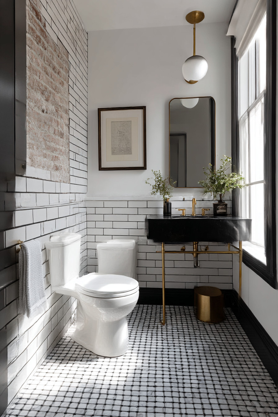
The first drastic move I made was extremely bold. I painted one wall of my main bathroom a deep navy blue – specifically Benjamin Moore’s Hale Navy, for those who are interested. My partner immediately believed I had gone crazy. “This will cause the room to appear smaller,” he stated. “This will become outdated within two years.” Fortunately, neither prediction proved correct. The navy wall provided a wonderful backdrop for the white fixtures in the bathroom to stand out as never before possible. The overall atmosphere of the room felt more luxurious and intentional. This wall, as opposed to diminishing the size of the room, created a sense of additional depth.
As previously mentioned, the key element to determining whether a particular wall should receive bold treatment is understanding what aspect of the room people notice first upon entering. In this case, I selected the wall located directly behind the toilet. As opposed to being hidden, this location is noticed by everyone who enters the room for the first time. If you decide to create a statement with bold colors, why not make it a focal point?
However, learning about bathroom paint the hard way taught me about the dangers of moisture. Although my navy-colored paint looked great for approximately six months, I began to notice minute bubble formations along the lower edge of each wall near the floor due to steam collecting. Upon further investigation, I discovered that I had utilized standard emulsion paint as opposed to using paint developed specifically for bathrooms. A rookie mistake. When I decided to repaint, I opted for Dulux Easycare Bathroom – although it cost approximately thirty percent more than previous options, it has characteristics that allow it to withstand the effects of humidity without developing blisters or flaking off.
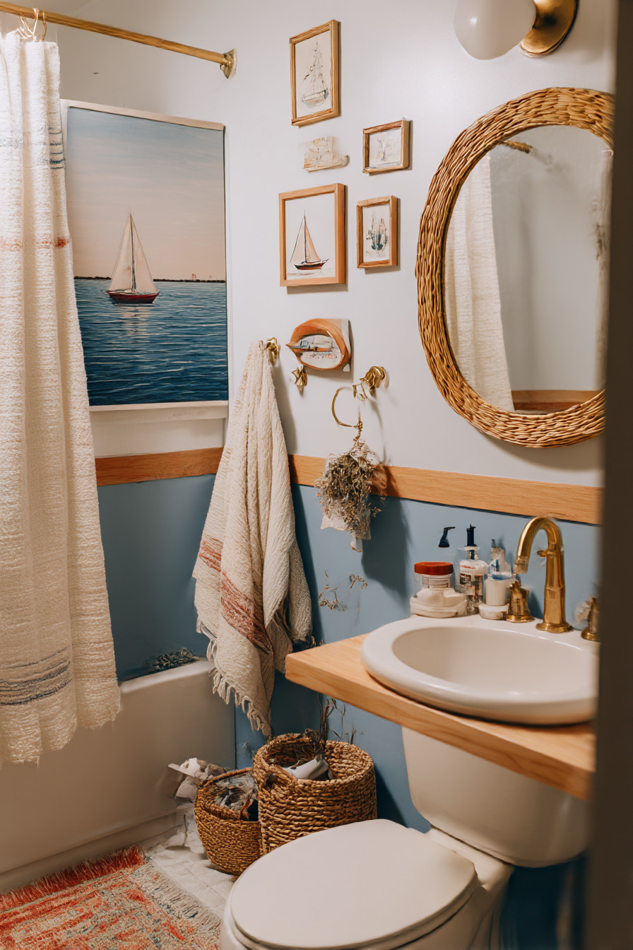
In contrast to my decision-making process regarding paint color selection, my sister elected to take an entirely different approach in regards to selecting a paint color for her en-suite bathroom. Her solution to selecting a paint color for her en-suite bathroom involved utilizing what she describes as “the hotel method”. She chose to paint the lower third of her bathroom walls a rich gray color (a shade often referred to as charcoal), whereas the upper third remained white. The dividing line between these two shades of paint sat precisely where a chair rail typically would sit — approximately three feet above the floor level. At first glance, this may seem unusual and overly-fussy; however, it truly is brilliant. The darker-colored lower section of her walls conceals stains and water spots caused by foot traffic in addition to splatters from toothbrushes while the lighter-colored upper sections maintain a sense of openness and brightness throughout the entire room.
To achieve a precise division line between the two shades of paint, she employed painter’s tape. However, she wanted to share a tip that she learned through trial-and-error when attempting to apply contrasting colors using this method. To avoid bleeding under the tape, she applied the base color first with brush strokes extending past the line established by the tape — allowed the initial coat to dry — then applied the contrasting color (the second coat). In other words, she allowed her brushstrokes to extend beyond the tape line during application of the base color so that she could prevent bleeding under the tape.
The two-tone concept works beautifully in powder rooms as well. For example, my neighbor painted her small downstairs bathroom with pink at the top and white at the bottom. Pink may sound strange for a bathroom; however, it is actually very sophisticated. The pink creates an optical illusion that allows ceilings to appear taller, and the white wainscoting (although merely paint) provides an upscale millwork aesthetic without requiring a contractor.
Accent walls are not the only way to add drama to your bathroom design. I have been conducting experiments on what I refer to as “sneaky color”, applying varying shades of color to specific areas such as windowsills and/or ceiling surfaces. The area surrounding my upstairs bathroom features an awkwardly-shaped recessed area where my window sits. I painted this recessed area with the same sage green hue I utilize in my living room. Since no one expects color in an odd-shaped recessed area adjacent to a window, it presents a delightful surprise. Additionally, by painting this recessed area with matching paint hues as those used elsewhere in your home, it connects your bathroom with the remainder of your residence in a subtle manner.
Using ceiling paint colors is another effective way to add visual interest to your bathroom design — particularly useful in bathrooms featuring sloping ceilings or unique architectural elements. For instance, my friend Sarah painted her ceiling a soft lavender hue (Farrow & Ball’s Pale Powder) — a color possibly costing more per liter than my monthly coffee habit. Regardless of price tag, it looks incredible. The lavender hue bounces off onto my white walls enough to create a soothing warmth.
Now let us focus on some practical issues related to bathroom design; as aesthetically pleasing as your Instagram-inspired designs may be, they will mean nothing if they cannot endure real-life conditions such as steam from hot showers, toothpaste splatters, hair products, and grime from general dirty fingers. With respect to finishes, I have determined that satin finish paints work better than matte finish paints in bathrooms; as they are easier to clean without leaving streaks or residue.
Another important factor is testing your chosen colors in various lighting environments. The lovely deep green color I initially envisioned would present itself as moody and spa-like; however, under harsh LED lighting conditions it appeared similar to hospital scrubs. Ultimately, I had to substitute warm-bulb lighting for my original LED lights; nonetheless, it presented a costly lesson in terms of how lighting can alter our perceptions of color.
Bold choices can also be incorporated into storage units in your bathroom. I have taken to painting the interior surface of my bathroom cabinet bright yellow simply for fun — although inexpensive (approximately $3 worth of leftover tester paint), it brought me a small amount of delight whenever I opened it.
Something I wish I knew prior to my experience with bathroom paint experimentation was that primers are significantly more essential in bathrooms than anywhere else in your home due to excessive humidity levels combined with extreme fluctuations in temperatures. Therefore, regardless of whether or not your paint contains claims of self-priming characteristics, it is crucial to utilize a premium primer on all surfaces in order to ensure that your newly-applied paint remains securely attached for longer periods of time. While this is an added expense and effort upfront, it ultimately saves you money by preventing premature peeling and blistering.
One recent successful experiment involving bathroom paint was painting my older wood-framed window frames with a matching color to that of my walls rather than continuing with their original white coloring. Although this alteration seemed minor compared to many others I implemented; however, it resulted in larger-looking windows and an overall more thoughtful/considerate design approach for my walls.