I went through a long process of agonizing over the color before deciding to go with Stormy Sky (a name that seemed wildly optimistic given its appearance). Something about that sample was nagging at me, however; I couldn’t quite bring myself to put it back on the shelf — despite every logical part of my brain yelling at me that gray cabinets would either look dull or depressing.
At the same time, I’d been avoiding starting the renovation on my bathroom for weeks, ever since I decided to take the plunge. A typical new-build bathroom, I’m sure you’ll recognize — Honey Oak cabinets that look like they’ve traveled from the Stone Age, Beige tile covering every inch of available space, that bland Magnolia paint job that developers seem to think is neutral but ends up being neither here nor there.
Obviously, I needed to tackle the vanity first. This huge piece of furniture occupies most of a single wall, creates the tone for everything else in the room, etc. And picking out a color seemed monumental — and I’m a guy who spends a minimum of 20 minutes determining what to eat for lunch. If it’s too dark, the tiny bathroom will feel claustrophobic. If it’s too light, it may come across as inexpensive or show every water spot and every toothpaste smear (and trust me, there are plenty).
The afternoon I spent traipsing around B&Q wasn’t meant to be a shopping trip. More like a therapeutic stroll while I avoided making real decisions. However, that particular sample of gray caught my attention repeatedly and eventually I thought “Sod it” and bought it along with approximately 15 other colors. For the next two weeks I was staring at paint swatches taped to my bathroom wall like some sort of indecisive artist in residence.
Grey vanities, however, are everywhere right now and this initially deterred me. I am not overly interested in making my flat look like every other renovation blog or Instagram post. There is however a reason why they’re so widely used. Grey vanities are neutral enough to complement literally anything you throw at them, but they also have some serious personality. Unlike Beige, which simply exists with an air of embarrassment.
When I finally committed to using Stormy Sky (thanks in large part to Jamie coming over and telling me to stop thinking so bloody hard) everything else fell into place. Not entirely true — the hardware decision nearly lost me my mind entirely.
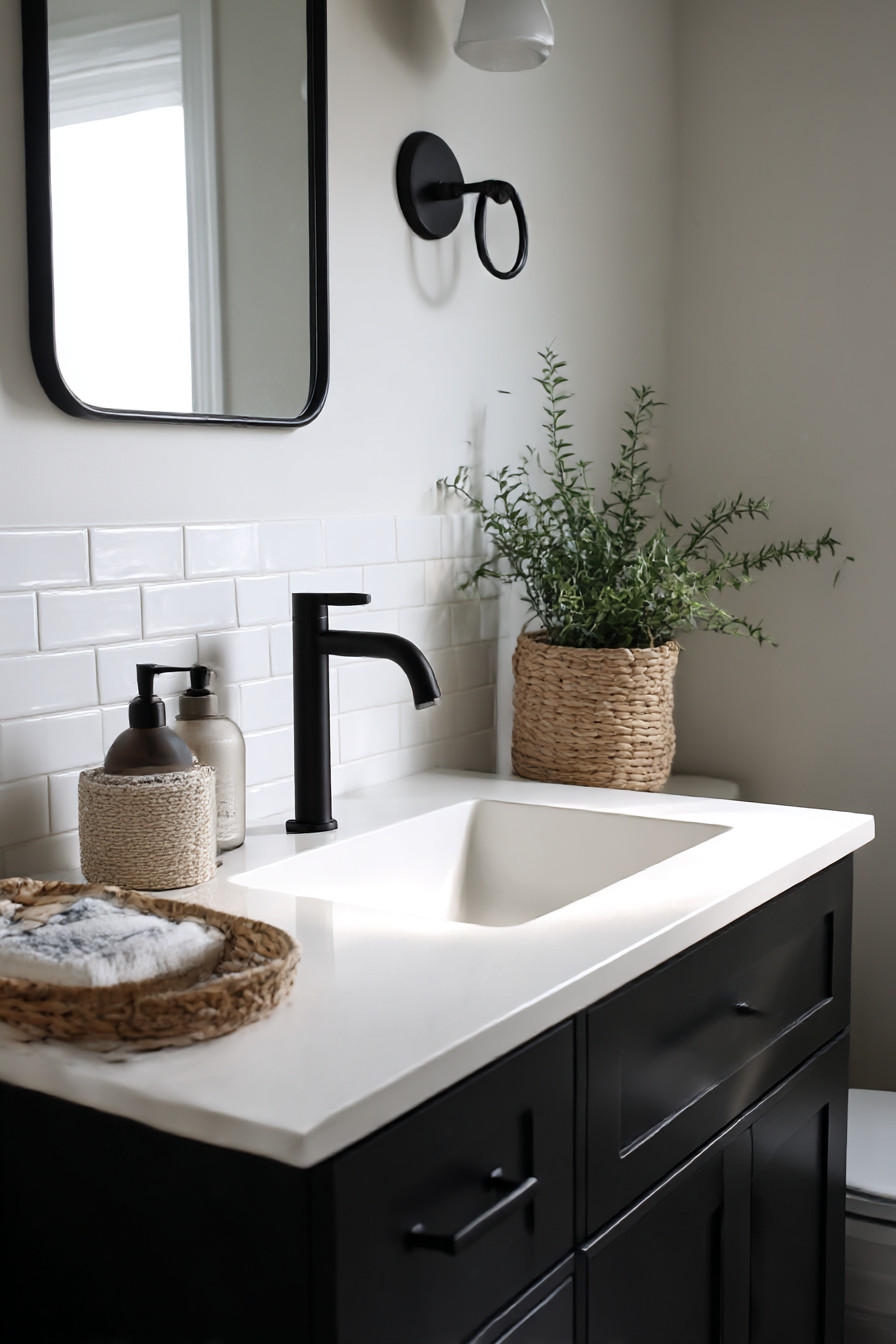
About an hour passed in the cabinet hardware aisle — yes, that’s apparently a thing I do now — holding various pulls up to my phone’s flashlight trying to envision how they would look on grey doors that didn’t exist yet. Brushed Gold looked great but felt too trendy — what if I grew tired of it within a year? Chrome was clean but possibly too sterile for a space where I’ll be preparing for work each morning. Then I saw these matte black pull handles with just enough texture to make them interesting. Simple. Solid. Made the grey look more mature and less competitive.
Steve — the bloke who worked at B&Q — told me that matte black and grey worked well together because you get contrast without excess drama. At the time he was right. I was mostly relieved that someone else thought my combination wasn’t complete madness.
The countertop debacle was the closest thing to breaking me completely. I had budgeted for Quartz because people rave about how practical it is. No need to seal it, won’t stain if you spew nail polish all over it etc. However, the bright white Quartz samples clashed with my grey cabinet samples and the darker options were far too heavy for the space. After days of deliberation I settled on this warm white Quartz with subtle grey veining that resembled actual marble but without all the stress of wondering whether EVERYTHING would stain permanently.
No-one tells you that you’ll change your mind regarding seventeen different items after you’ve already ordered them. Initially, my intended drawer pulls were these modern-looking, geometric pieces that looked amazing in their online pictures. Modern. Sleek. Angular. However, once they arrived and I could hold them against the cabinet door they felt utterly wrong. Far too angular; they appeared to belong in an office block rather than somewhere I’d be stumbling about half asleep at 6am.
Returning them was an absolute nightmare — Shipping costs + Restocking Fees + Customer Service Runaround. But ultimately, the slightly curved drawer pulls I chose later on look infinitely better. Contemporary still. Don’t scream “Look How Trendy I Am!” every time you open a drawer.
Once the grey vanity was installed, it provided this central reference point that made all my subsequent decisions easier. Which was a welcome respite, as decision-making appears to be firmly outside of my comfort zone during this project.
Wall color became relatively easy after that. Bright White would provide sufficient brightness in addition to providing a perfect base for the taupe walls behind the mirror. Flooring (Luxury Vinyl Plank resembling weathered oak) would provide additional texture & warmth under foot and pick up on the neutral theme established by the vanity.
What shocked me most was how Stormy Sky varied throughout the day. In the mornings when sunlight entered through the window it made the cabinet appear close to blue-gray, fresh & cool while I attempted to shake off sleepiness. When illuminated by the vanity lights in the evenings it warmed up considerably and gave the feeling of coziness. I hadn’t anticipated such variability from what originally appeared to be merely Dishwater Gray in the paint sample.
Storage was the game-changer after months of suffering through a pedestal sink (another long story — don’t ask). Having actual drawers was an indulgence. They were deep enough as well – I can store all of my hair styling products in the bottom drawer and still have ample room for extra towels. Worth every penny those soft-close hinge mechanisms turned out to be as well — especially considering my desire to avoid waking up the entire building at ungodly hours in the morning.
Finding a suitable mirror was another experience altogether. I had planned on purchasing a standard rectangular one but when placed near my grey cabinet, the proportions appeared to be somewhat uninteresting — perhaps too mundane? Ultimately located this round mirror featuring a slim black frame instead that mirrors the cabinet hardware. Softens all those linear features and makes the overall aesthetic look more thoughtful — as though I knew what I was doing.
In terms of maintenance, this vanity has proven surprisingly low-maintenance. Water spots don’t show as clearly on the grey finish as I expected and even my questionable ability to spit toothpaste has produced fewer stains than I would have predicted had I chosen white cabinets. Fingerprints show up fairly easily on matte black hardware but wiping away is a simple task.
This grey vanity works because it does not attempt to be the focal point. Sufficiently substantial to ground the entire area but neutral enough to allow other elements in the room to shine — including the textured shower tiles I eventually managed to gather enough courage to install, as well as the brass lighting fixture that took three attempts to properly secure, and even my plants sitting on the windowsill.
It’s akin to possessing an excellent pair of jeans in your closet — goes with anything and makes everything else appear cleaner-cut than likely is.
Will I select grey again? Absolutely — although next time, I might opt for a slightly deeper shade simply to observe what transpires. But based on past history, I suspect I shall spend another fortnight gazing at paint swatch after paint swatch first.